
DATA ANALYTICS · MACHINE LEARNING · DEEP LEARNING

Yi Pan

Data-mindedHands-onBusiness-curious

I like understanding how things work—and how they can work better for a business. My background spans data science, hands-on engineering in US teams, and supply-chain coordination for North America. I’m interested in AI applications and data products that turn a real need into something useful.

Explore my projects

ACADEMIC FOUNDATION

Education

  • Rice UniversityMaster of Data Science
  • Drexel UniversityBachelor of Science · Data Science
  • Lanzhou UniversityBachelor of Engineering · Computer Science & Technology
Open to AI Application Product, Data Product & Business Analytics roles

Technical Depth+Business Context

A data science foundation, experience building working systems, and an interest in the decisions those systems support.

At SUMEC / FIRMAN, four months of work on North American product support and supply-chain coordination gave me practical exposure to customer feedback, parts orders, and delivery constraints.

Analyze

Python · pandas · SQL

Customer analysis, metric definitions, and evidence-based recommendations.

Model and Architecture

PyTorch · TensorFlow · Scikit-learn · OpenCV

Machine learning, Transformers, graph theory, and computer vision.

Integrate

Flask · Git · Docker · AWS S3 / EC2

Connecting models to applications and collaborating across engineering disciplines.

Projects & Experience

Customer decisions. Physical systems. Connected services. Four projects, viewed through their results and the work behind them.

01

AUDIENCE & BUSINESS

Houston Grand Opera

University–industry collaboration

Understanding when opera audiences become donors.

A Rice D2K collaboration with Houston Grand Opera: connecting audience profiles, donation timing, and fundraising decisions through survival analysis.

Donor conversionSurvival analysisCustomer analytics
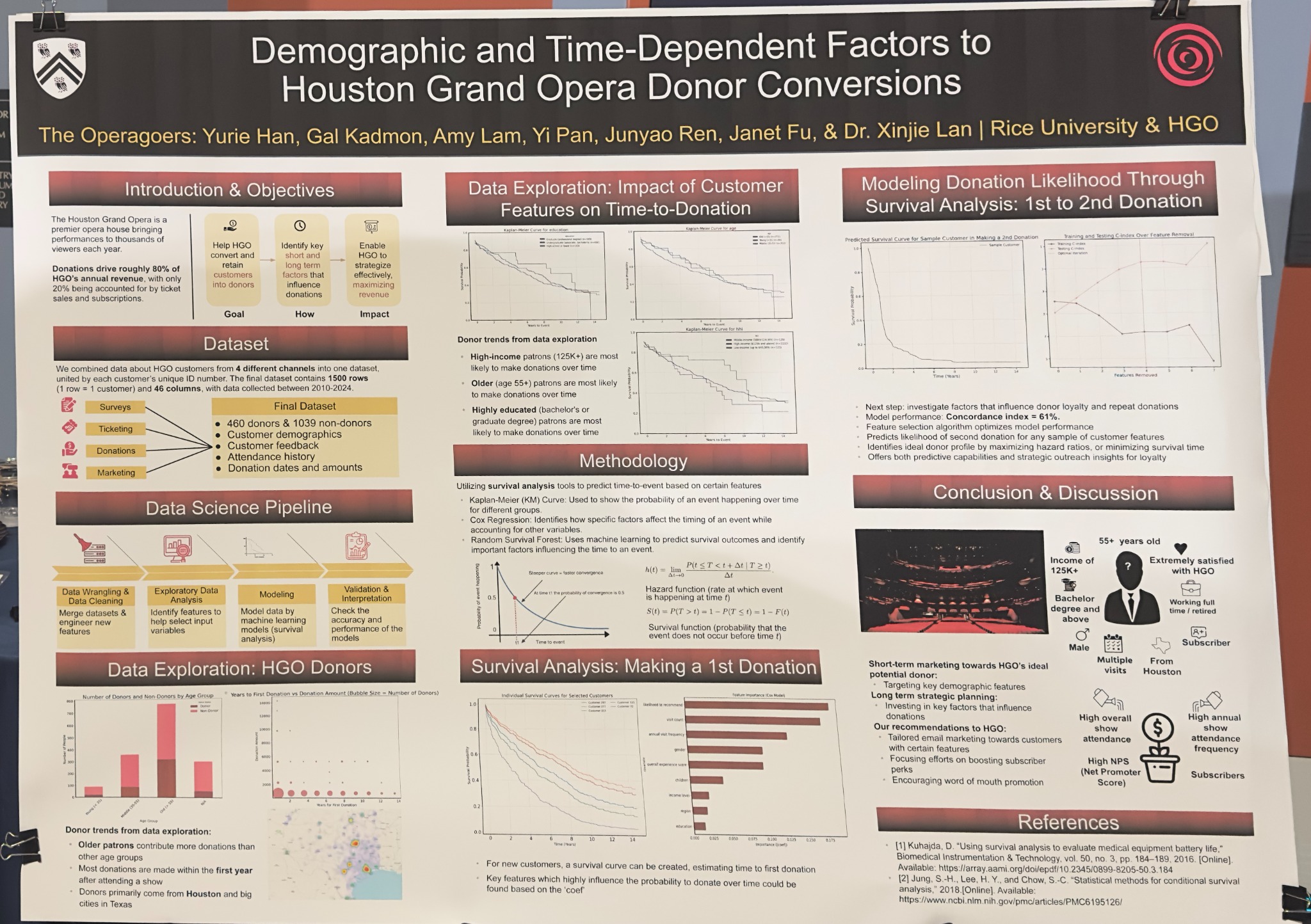
Houston Grand Opera donor conversion project poster presented by the Rice teamView presentation poster
Customers before cleaning & filtering
~13,000
First-donation RSF · Evaluation C-index
0.733

The source data covered approximately 13,000 customers across survey, ticketing, donation, and marketing records. Unusable or unsuitable records were excluded during preparation; the experiments below use their eligible subsets, not all 13,000 customers. The analysis used 46 features, including age and income.

THE DECISION

Who should the team understand and engage next?

I worked across data integration, EDA, survival modeling, evaluation, and recommendations in the Rice–HGO team, and presented the findings through a poster and live Q&A.

4

Data Sources

Survey · Ticketing · Donations · Marketing

46

Features

Age · Income · Attendance · Subscription

3

Analysis Methods

Kaplan–Meier · Cox · Random Survival Forest

From Customer Profile to Outreach Plan

A Profile to Explore
  • Age55+
  • EducationBachelor’s or higher
  • Household Income$125k+ / year
  • LocationHouston
  • RelationshipSubscriber
  • EngagementHigh satisfaction & recommendation intent

A group-level profile to guide outreach exploration, not a description of every donor or an individual eligibility rule.

Recommended Actions
  • Frequent Attendance

    Give repeat visitors relevant follow-up and consider annual visit frequency when planning outreach.

  • Subscription Relationships

    Build on existing subscriber relationships and strengthen subscriber benefits.

  • Strong Recommendation Intent

    Support engaged customers with a good experience and opportunities to recommend HGO to others.

Recommendation intent asks “Would you recommend HGO?”; satisfaction asks “How was your experience?” The notebook’s nps field is an individual response. Group NPS is the share of promoters minus the share of detractors.

These are proposed actions informed by the analysis; resulting fundraising gains were not measured in this project.

Where Are the Customers?

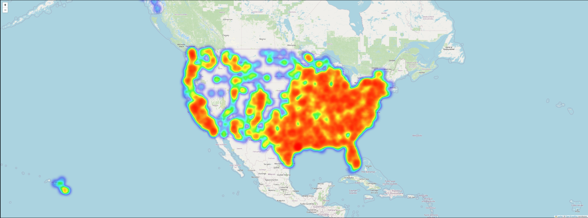
Mapped customer ZIP codes to explore their geographic distribution across the United States. The heatmap helps describe audience reach; warmer areas indicate stronger concentrations in the displayed data, not higher donation rates.

Customer distribution by ZIP code · EDA output · Basemap © OpenStreetMap contributors

When Might a Customer Donate?

The question is not only whether someone donates, but how long it might take. Cox links customer features to donation timing; Random Survival Forest (RSF) combines decision trees to capture more complex patterns.

Task and ModelTraining C-indexEvaluation C-index
First donation · Cox, full feature set0.7310.717
First donation · Random Survival Forest0.8000.733
Second donation · Cox, before feature selection0.6030.581

Saved notebook outputs, rounded to three decimals, from 80/20 splits. These are exploratory results: evaluation data were also consulted during feature and parameter selection. They are not a fresh, untouched final test. The poster’s second-donation score of 0.61 is from a full-data fit; feature-removal experiments reached about 0.625 on the reused evaluation split.

Reading the Results

C-index: Who Donates First?

If A donates before B and the model puts A first, that pair is correctly ordered. A score of 0.733 is roughly 73 correct out of 100 comparable pairs; 0.717 is about 72, and 0.581 about 58. A score of 0.5 is near random ordering—not a customer’s donation probability.

Cox: Which Features Relate to Earlier Giving?

The full first-donation model gives annual attendance a hazard ratio (HR) of 1.11. For 4 versus 3 annual visits, holding other features equal and before either person donates, the instantaneous donation rate is about 11% higher—not an 11-percentage-point probability increase.

Kaplan–Meier: Who Is Still Waiting?

It estimates a waiting curve from observed records. If 10 people are followed for a full year and 3 donate, the curve ends at 70%. Someone observed for only six months still contributes those six months; they are not treated as someone who will never donate.
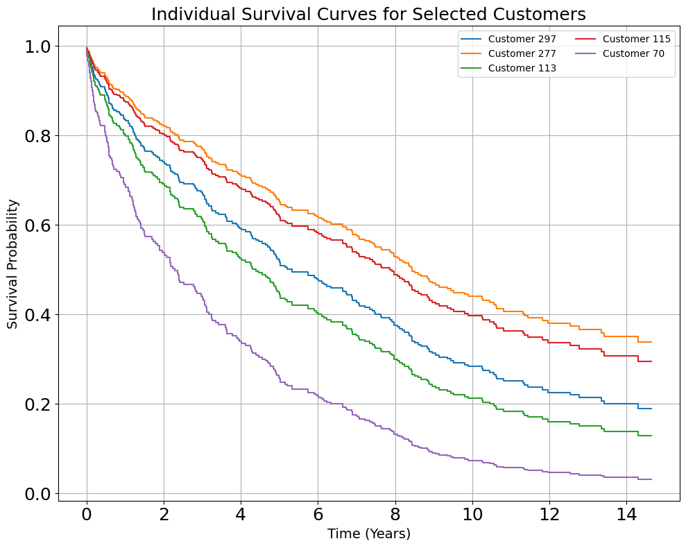
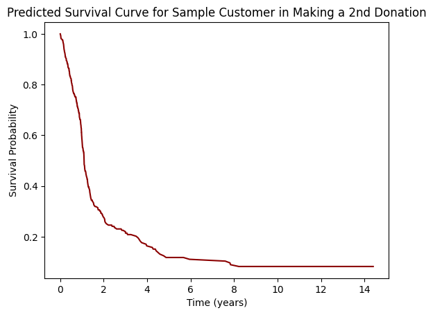
About C-index and survival curves
First donation · Cox predictions · One line per customer. The horizontal axis is years of waiting; the vertical axis is the predicted chance of no first donation yet. Faster decline means an earlier predicted donation.
Second donation · Cox predictions · Time starts at the first gift. A higher curve means a higher predicted chance of still waiting for the next gift.

Reading example (illustrative): if a curve is at 0.70 in year 2, the chance of still waiting for the target donation is 70%; the chance it has happened by then is 30%. “Survival” here means the donation has not happened yet.

INTERACTIVE DEMO · PROFILE TO ACTION

Understand One Customer. Plan the Next Step.

Build a prospective first-time donor’s profile. Explore timing, a gift scenario, and a possible next action.

University–industry collaboration: source data and models are private. This demo visualizes the project’s output format using illustrative rules and example values.

01 / Customer Profile
02 / Relationship with HGO

Fields reflect the notebook and audience profile. Age increases in small steps in this demo only; the Cox results did not establish a positive age effect. Region bands are illustrative: ≤50, >50–150, and >150 km.

SIMULATED SCENARIO
Chance of a First Donation Within This Period
—

How the Time Window Changes the View

More time creates more opportunity for a first donation. The example keeps this profile unchanged.

Probability-Weighted Amount

What Drives This Example?

A Possible Next Step

Five illustrative propensity levels: very low <15%, low 15–<30%, medium 30–<50%, high 50–<70%, very high ≥70%. Gift size is an input assumption; the project’s survival models estimate donation timing, not gift value.

↑ Project index
02

VISION & PHYSICAL SYSTEMS

Crane Payment Innovations

Software Engineering Internship · Sep 2022–Mar 2023

Testing a vision retrofit for an existing vending machine.

A camera-based retrofit study: move the camera to the target column, recognize products, and establish the practical limits of depth-wise counting before the company considers further investment.

YOLOv7 · PyTorchYOLOv4 · TensorFlow 2.0AWS S3 / EC2Vision Retrofit
Device demonstration · 8 sec · silent

Model Comparison

A Different Model. A Stronger Result.

Same dataset · Same EC2 · Equal epoch count

YOLOv7 · PyTorch98–99%

Final model · Test accuracy

>2×Equal epochs · Less than half the time

Historical test-accuracy estimates recalled from the project, not F1 or mAP. Training time compares the same epoch count, dataset, image size, and EC2 configuration. Model version and framework both changed; the gain cannot be attributed to architecture alone.

THE BUSINESS CASE

Can an existing machine gain useful vision capabilities through a retrofit? My role was to establish technical feasibility and operating limits; the company evaluated cost and the next product decision.

Mechanical Engineering

3D design · Arm retrofit · Camera installation

My Work

Camera control · Data pipeline · Models · Device integration

Implementation Workflow

  1. Device & Local Scripts

    Data Collection
    1. 01
      Position & Capture

      Move the camera to the target column’s center; capture images with Python / OpenCV.

    2. 02
      Prepare Images

      Organize images and labels for object-detection experiments.

  2. AWS Cloud Platform

    Cloud Training
    1. 03
      Store & Connect

      Amazon S3 stores the images; an Amazon EC2 GPU instance runs training on Linux. SSH keys provide secure remote access.

    2. 04
      Train & Select

      YOLOv4 with TensorFlow 2.0 for earlier experiments; YOLOv7 with PyTorch for the final model.

  3. Local Prototype

    Device Integration
    1. 05
      Integrate the Model

      Move the selected model from Ubuntu to Windows and connect the camera and positioning system.

    2. 06
      Run & Inspect

      Run product recognition and counting on the prototype; inspect detections in the camera feed.

Cloud compute supported training; inference was integrated into the local prototype. The diagram summarizes the confirmed work rather than a detailed infrastructure topology.

The Hard Part: Seeing Behind the Front Item

Products share the same line of sight. The task is to separate partially visible items, rather than count eight clearly separated objects.

CAMERA VIEW · SCHEMATICFront → Rear
0102030405067–8: almost hiddenCameraRear · Less lightFront · More visible
In the tested position and layout: the first six items were recognized; the last two were almost fully covered. The diagram explains the geometry, not the detection boxes from a video frame.
What the Model Must Learn

Use the remaining visible edges and appearance to distinguish overlapping products. Small exposed areas and dim light make the rear items harder.

Where the Limit Appears

Almost no visible pixels remain for the last two items. Lighting and camera-angle changes are possible next tests for the company.

Prototype demonstration · 13 sec · silent

Company-owned work. Demonstration videos show the prototype output; source code, internal datasets, and non-public implementation details are not shared.

↑ Project index
03

GRAPHS & PREDICTION

NYC Traffic Prediction

Team course project · 2022

Learning how connected roads influence traffic speed.

New York City traffic-speed prediction using Uber Movement data, OpenStreetMap road structure, and a multi-head graph attention model.

Graph attentionPyTorchTime seriesExploratory analysis
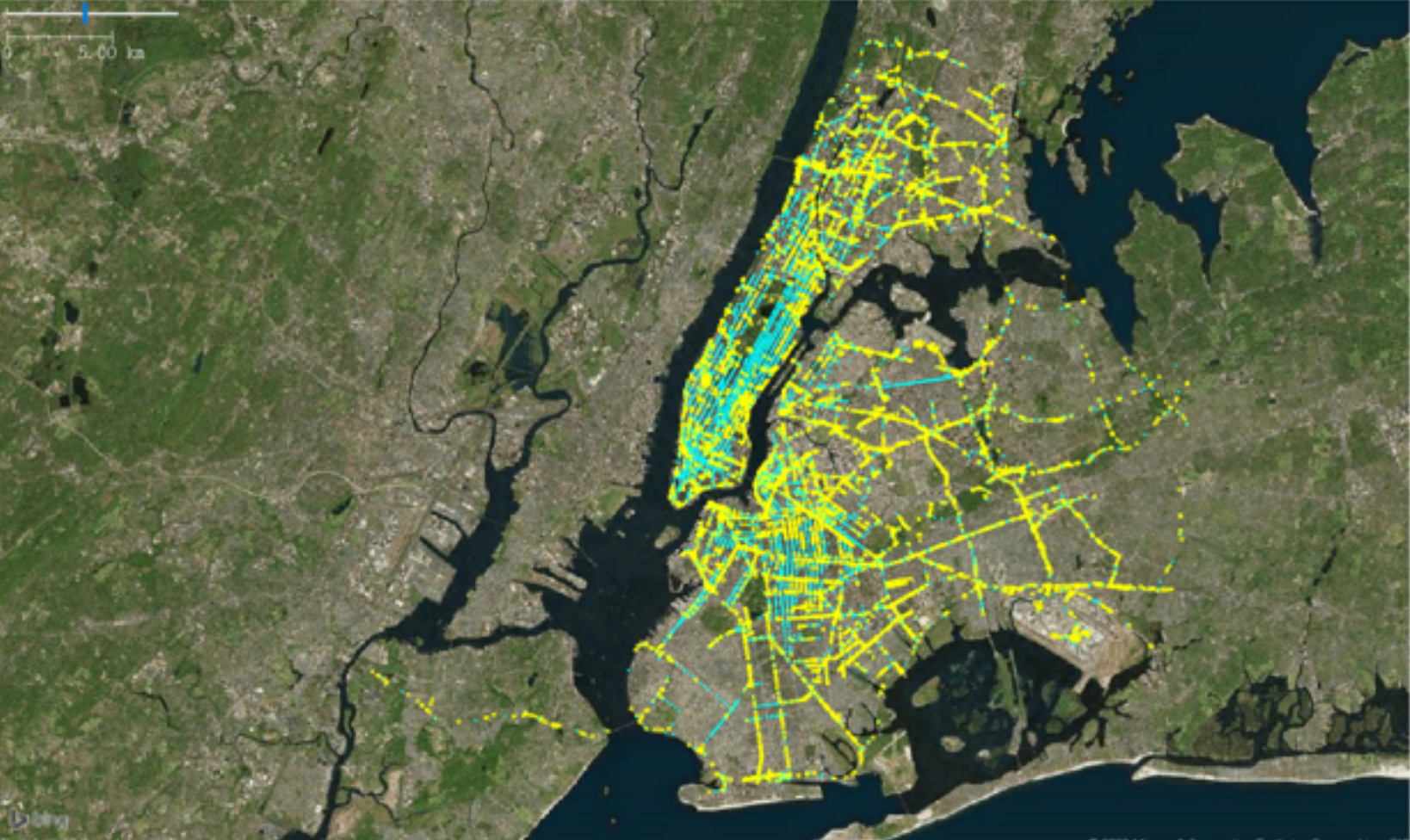
New York City road network used in the traffic projectNew York City road network · Project visualization
Graph nodes
21,947
Graph edges
74,783
GAT · MAE (report)
7.1

Why a Graph?

I contributed throughout the three-person project: data preparation, EDA, graph construction, multi-head GAT implementation, and evaluation. Road connections define which neighbors can exchange information; attention learns their relative weights.

EDUCATIONAL SIMULATION

One Road. A Network of Signals.

Select a node. Change its recent history or its neighbors. Follow the information into a next-hour speed estimate.

SelectedDirect neighborOther node

Node D

The model uses 24 hourly speeds per node plus road connections. These three controls are shortcuts for changing that history—not the model’s complete feature list.

Illustrative Speed Estimate

—mph

Weighted Neighbor Speed
−23 hLatest hour

Each node carries 24 hourly speeds. Edges determine which nodes can share information.

Larger percentages mean this neighbor receives more weight when combining the neighbors’ information.

An interactive simulation to make the project’s inputs and outputs easier to understand. Example speeds and weights respond to your choices. Units: mph (miles per hour). Congestion cutoffs follow the report: 15.91 / 20.88 / 33.80.

Data Preparation & Network Structure

Preprocessing workflow · Report Figure 3

Build a graph from road identifiers, select a better-covered subgraph, then align hourly speeds and fill missing values. Filled speeds are assumptions, not additional observations.

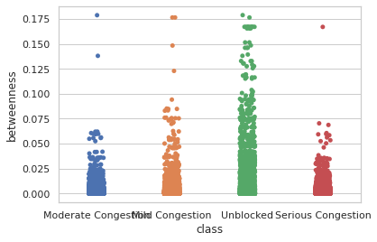
Betweenness centrality by congestion group · Report Figure 24

Betweenness asks how often a road acts as a bridge on shortest routes. A larger value means more routes pass through it. The groups overlap, so a central road is not necessarily a congested one.

MODEL OUTPUT

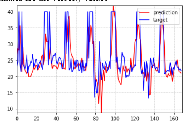
Predicted vs. Observed Speed

The report records a GAT MAE of 7.1 and RMSE of 9.55 (Table II), alongside a prediction-versus-observation plot for the final seven days. Values are quoted as reported; the table does not specify their units or scaling. The 744 time steps include filled gaps, rather than 744 measured observations for every node.

MAE is the average absolute error: predicting 25 when the observation is 20 gives an error of 5. RMSE penalizes larger misses more strongly. Compare them on the same scale; lower is better.

Predicted and observed speed for one node in the report's test period.

Team: Harry Zhao, Yi Pan, Yantian Ding. Static figures and experiment metrics come from the team report; this was a course project, not a live traffic service.

↑ Project index
04

DATA & APPLICATIONS

StarTree

Software Engineering Internship · May–Aug 2024

From operational data to configuration recommendations.

A machine learning service for infrastructure capacity planning, connecting Python model inference with a Java application backend.

Pinot SQL · WgetScikit-learn · FlaskREST · DockerPrompt Engineering
DOCUMENTED INPUTS

Historical Metrics

Kafka → Apache Pinot

Stream data → Queryable recordsSQLGrafana · Query & Visualize

Web Data

Retrieve web content

Wget
DATA

Prepare & Integrate

Historical metrics + web inputs

MODEL SERVICE

Scikit-learn + Flask

Random forest regression · Initial configuration

APPLICATION

Java
Spring Boot

HTTP / REST

The Java application calls the Python prediction service.

Configuration Recommendation

Docker · GitHub Actions

My Contribution

Built data preparation, a Flask prediction service, Docker packaging, and REST integration with the Java backend. Also explored prompts for a separate internal AI task.

SQL + Grafana

Queried historical metrics with SQL in Grafana and visualized CPU usage to understand operating load alongside the configuration-recommendation work.

Separate AI Exploration

Designed prompts and reviewed responses for an internal AI task; this exploration did not reach deployment.

Company project. The architecture summarizes the documented workflow. Internal code and data are not public; the separate prompt-engineering exploration did not reach deployment.

↑ Project index

NEXT CHAPTER

Contact

Open to AI Product Manager, Data Product, Data Analyst, and applied Data Scientist roles. Interested in work that connects technical delivery with business needs, including international teams and overseas projects.